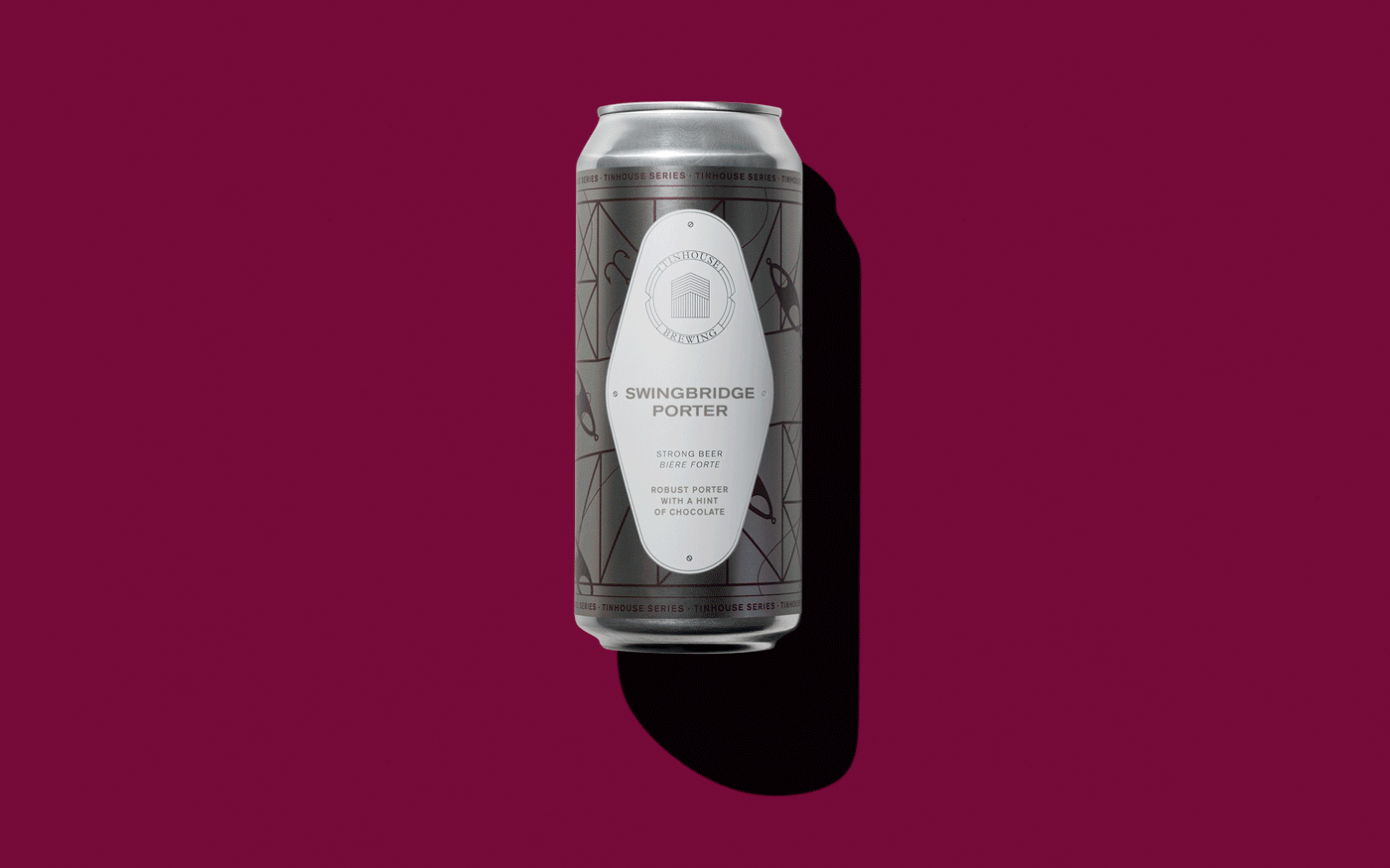
Tinhouse Brewing Co.
Background
When a group of four friends, driven by their obsession for beer, got together, The Tinhouse Brewing Company was born. Located in Port Coquitlam, Tinhouse is the newest addition to this fast-growing brewery community. Much like our team at Carter Hales, Tinhouse doesn’t take themselves too seriously, but do take their craft extremely seriously. Tinhouse has created a place where anyone can get together over a universal love of beer. Whether you want to hang out after a long bike ride or gather around for a board game, this relaxed, kid-friendly, and unpretentious brewery brings everyone together in the best way.
Challenge and Opportunity
We were ecstatic when Tinhouse asked us to jump onboard with the start-up and be their branding agency. As a new company in a fast-growing industry, we needed to create something that would help their product stand out amongst the rest of the competition. Before we started the concept exploration phase, we needed to meet the people at the heart of Tinhouse. From Discovery, we gathered that Tinhouse would juxtapose the concept of industrialism and the natural world in a clean, recognizable, and unique way, without looking overdone and busy. At the heart of their brand is a fun, relaxed, down-to-earth, and inclusive environment that the visual identity needed to reflect. Most of all, the visual identity needed to stand out on the shelf among other craft breweries.
Solution
After careful consideration, we developed a practical visual identity that embodies the Tinhouse vision built on friendship and community. We found a balance between the four personalities behind the brand to create one unified look. We also drew inspiration from the sheds at The Pitt River Boat Club, located in Coquitlam, and by the nordic architecture reflected in their shape and design. This was the perfect nod to the brewery’s location and community. The logo became the iconic shape of a single tin shed. The design is utilitarian while still being beautiful, and maintains extreme simplicity. The mark is crafted with a recognizable shallow rooftop, a short and wide face, and vertical panelling. Holistically, the design elements come together to represent everything that Tinhouse is: beer, fun, and friends.
Photography: Jason Scott Studios
Our Services
LOGO DESIGN
BRAND IDENTITY
PACKAGING DESIGN
PRINT DESIGN
ART DIRECTION
SOCIAL MEDIA STYLING


